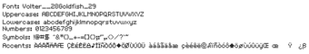
Bitmap pixel font capturing Habbo-era UI typography
Volter Goldfish, by Volter Goldfish, is a bitmap pixel font created to reproduce the Habbo Hotel user-interface typeface for small-scale text. The font renders aliased glyphs tuned for pixel clarity and targets UI, chat bubble, and pixel-art text with explicit guidance for non-antialiased rendering. It includes a full basic character set and suits graphic designers, pixel artists, and retro-game developers seeking authentic early-2000s typography.
What does Volter Goldfish change in small-scale text?
The font is a bitmap, aliased design built for legibility in constrained UI contexts and it served as the primary typeface in Habbo Hotel. Its letterforms are compact and grid-aligned, which keeps strokes visually distinct at low pixel counts. The character set covers uppercase, lowercase, numerals and basic symbols, so it can replace generic system fonts in interface mockups and nostalgic projects.
How precise is its pixel rendering at intended sizes?
Volter Goldfish uses a pixel-perfect bitmap approach optimized for very small sizes, and rendering guidance specifies 9pt or 12px as the ideal target. Anti-aliasing off preserves the intended sharp, square pixels, and the design avoids subpixel smoothing that blurs stroke junctions. For designers this means text aligned to an integer pixel grid maintains the original Habbo aesthetic.
Is installation and everyday use straightforward for desktop projects?
Installation on Windows requires the standard TrueType route: right-click the downloaded .ttf and select "Install" to make the font available to desktop applications. The format keeps the asset lightweight and places no visible background processes, so embedding the font in a UI mockup or game build is practical without added runtime overhead. Typical design tools display the bitmap shapes once anti-aliasing is disabled.
Does it work across platforms and how is it received by the community?
The font runs on Windows and on other systems that accept TrueType or OpenType files, which makes it portable for cross-platform pixel-art projects. The designer, known as Volter (also referred to as Goldfish), receives steady positive feedback in pixel typography circles for functional clarity and nostalgic value. Community interest keeps the font visible on repository sites used by retro designers.
A focused choice for pixel-era interfaces, with a licensing check advised
Volter Goldfish is a practical option for creators aiming to reproduce authentic early-2000s interface typography in pixel-focused projects; it supplies the recognizable Habbo-era look without heavy resource demands. Confirm the included license before commercial use, and consider embedding or rasterizing text in final assets to preserve the precise pixel grid across different rendering engines.
Pros
Pixel-perfect clarity at intended small sizes
Comprehensive character set for UI text and numerals
Lightweight TrueType file with minimal runtime impact
Recognizable Habbo-era aesthetic for retro projects
Cons
Not suitable for large-size or smoothly anti-aliased typography
Commercial-use terms require checking the bundled license
Bitmap design lacks scalable vector detail for high-resolution layouts
Laws concerning the use of this software vary from country to country. We do not encourage or condone the use of this program if it is in violation of these laws. Softonic may receive a referral fee if you click or buy any of the products featured here.